On this page, I hope you’ll find some useful ideas on getting more "character" into your haracters.
First, let’s start off with one of my sculptures.
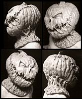 Now, this is obviously a Jack O’ Lantern design, but hopefully, there’s some other "layers" of emotion going on.
Remember the movie "Shadow of the Vampire"? In it, Willem Dafoe portrays Nosferatu in a many layered performance. He’s not just
scary, he’s also often pathetic and sad. And, at the same time, funny.
I don’t know how he managed to do all those things simultaneously, but it’s a great example of a character with a lot of depth. I’m not
saying I’m as good, but I think this is a good example for us to keep in mind when sculpting a character. Just scary? Oftentimes, that’s just not enough.
For me, the process didn’t happen overnight. Early on in my endeavors,
it was enough to just make a piece look like what it was supposed to "be". Then, as the years went by, I felt that the work needed more. There’s just something about a standard issue monster that started to bore me. What was missing?
Well, often, a beginner is very concerned with the technical aspects of making something follow proper anatomical proportions, etc, and this is enough to keep him or her occupied for the first couple of years of their craft. Just getting good at the basics is really enough to worry about at the start. There are plenty of artistic anatomy books and charts out there, and if you’re new to sculpting, it is imperative that you make use of these.
However, as time goes on, you may realize that a sense of personality and individuality in a sculpture is something that you really enjoy then looking at some of your favorite work out there. Here are some of my thoughts on how to be "original" and get out of the rut of Boring Monsters. (There’s nothing worse than a Boring Monster!)
One of the ways to do this is infusing a character with a certain attitude, which in this case is the character’s whole psychology wrapped up into one expression, which, I admit, is a lot to ask of a single sculpture. I have attempted this with my interpretation of the Seven Sins. This was a challenge, because, for example, how do you show that a person is slothful, or lustful, just from his face? (Also, how do you do this with out being gross, since these had to have enough appeal to hang on people’s walls). Obviously I couldn’t do characters like in the movie "Seven". That would have been fun, but far too horrifying to look at day after day. No, I had to use humor to get the message across.
(The job was to make them look like they were carved out of stone, like a cathedral gargoyle, so a stone like texture, and a high degree of stylization, were required.)
Here’s what I ended up with:
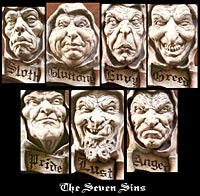 Each individual Sin took a bit of thought concerning just how far to go, while not becoming too disgusting. I really could have pushed this much, much further, but it would not have been appropriate for the task at hand.
What I did was call upon my love of political caricature. Caricature is a wonderful way to learn about depicting personalities. One of the best cartoonists in this area is a guy named Bill Plympton. There are many others as well. Look up books of political caricature, there’s a lot of good inspiration there. It teaches how to exaggerate the human form almost to the breaking point, while still maintaining a recognizable personality. From there, you can add enough "monstrous" elements (horns, teeth, etc) to make it as otherworldly as you want.
Lets take a closer look at what I did with these guys.
Sloth. Sloth had to be sickly, and weak. Somebody you wouldn’t trust for a minute. His flesh is emaciated, and we imagine his muscles are atrophied. If he were painted realistically, we would see filmed over pupils, very dark circles under his eyes, and a general deathly pallor. Weakness is conveyed by the lack of chin and jaw. The nose had to be aristocratic, yet bulbous, like a pampered member of a royal family. If his ears were shown, they would be very large. His hair is stringy and moist. His eyes barely open, as the light of day is too much for him.
Gluttony. Besides being bloated, Gluttony has a wicked gleam in his eye denoting his joy in eating the last of everyone’s leftovers. And everything else. They say that admitting you have a problem is the first step on the road to recovery, but gluttony will never reach that stage. He is far too satisfied with himself.
Envy. Envy has such a sense of distaste towards his fellow man that his face is twisted into a permanent sneer of contempt. His eye sockets are puffy from always sniffing, and squinting suspiciously. His mouth is compressed down into an expression of disapproval of all people’s activity, since he knows he will never be a part of their reindeer games.
Greed. Greed is consumed by an all-encompassing hunger. He hungers for all he sees. Long ago he perfected the slimy, insincere smile of a politician, but somewhere along the way it contorted, against his will, into a grimace of eternal need.
Pride. Pride’s neck has grown into such a position that he will never again be able to turn down to look straight into the eyes of the sad population about him. In fact he doesn’t even notice them any more. His eyes show a complete sense of self-satisfaction. He knows that
the strong set of his chin, his powerful skull structure, and manly stature demonstrate to world that his pronouncements hold a self-evident truth.
Lust. You know what Lust is all about. Grotesquerie and obscenity could have been the downfall of this sculptural representation, until, at the last minute, almost, I hit upon the idea of placing him into a past era, where equality of the sexes was not in vogue, and there were men who had their pick of the harem. However, we should not jump to any conclusions about what he is lusting after. Women….money…power, there is nothing that evades his attentions.
Anger. If there is a point at which the human body can go before bursting in an explosion of flaming hatred, Anger is at that point. His skin is crimson with the blood just waiting to burst forth from their capillaries.
His rage has reached a point where all carefully cultivated human reason is no longer a factor; he has reached an animal level, where the enemy will be reduced to shreds long before any rational thought is again possible.
The main thing to remember is: Don’t create what will end up being a generic, indifferent, monster form. Teeth, horns, scars, fangs, are not enough. That is, something that fulfills all the technical criteria of being a monster, but without real feeling behind it. You’ve seen examples of this failing. You know what I’m talking about. Sculptures that just sort of sit there. You want a dynamic expression. You can’t do this with a prosthetic, because the expression has to be neutral, but in a mask or kit sculpture, make it as dynamic as you can. When a comic book illustrator creates a panel or a cover, he chooses to show the very height of the action in any particular moment. Keep this principal in mind.
One thing that causes some artists to create a creature that’s a bit on the "generic" side is basing most of their ideas on what a monster is on what other artists have done. There’s some amazing work out there, done by the greats of the field, but don’t fall into the trap of only being inspired by what they’ve DONE. Be inspired by what they were INSPIRED BY.
Look at the following picture of Dick Smith sculpting. See the pictures on the walls?
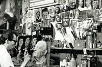 If you’re a sculptor and you’re interested in masks and FX work, you’re familiar with Dick Smith’s brilliant work. The trouble is, so is everyone else. This means that at some point, everybody is going to sculpt something that Smith has already done. Same with Rick Baker. These are the "old masters" of our particular field. And just like the Old Masters of the Renaissance period, their work has been copied, and copied again, until the subject matter has become nothing more than a cliche.
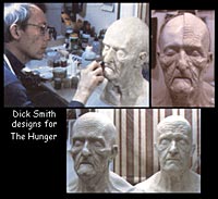 Let’s take just one example. In "Little Big Man", Smith created one of the icons of FX makeup, Dustin Hoffman’s old man character. Later, he carried this work even further in "The Hunger".
The prosthetics were revolutionary for technical reasons, but also they were trend setting as far as style. Look at Tom Savini’s work for "Texas Chainsaw" part Two. There are some good shots in the book Grande Illusions.
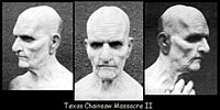 Look at the face. Look familiar? Yep. It’s basically the Dick Smith design, with the additions of a more prominent brow, and some sores, to make the character look sickly. The main difference is that the earlier ones followed the contours of Dustin Hoffman’s and David Bowie’s profile, out of necessity.
In NO way am I saying that it’s a rip off. It’s still very good work.by Savini and his artists. However, it’s the first step in this particular face becoming turned into a cliché. In the years since, so many other pro and amateur artists have copied that face as the "standard" old man face, that all originality, and character, has been leached out of it. Ever make a Xerox of a Xerox? It gets worse every time. I’ve seen a lot of really uninspired "tributes" to this design. And what happens is, the artists are no longer copying from life. They’re copying from the last person that copied from the last person before THEM. Stop the madness!!
Artists sometimes fall into the same trap when creating fictional creatures as vampires, werewolves, you name it. I see a lot of uninspired copies of other’s uninspired copies. If you follow this trend, your work will get stuck in a rut. The way to break free of it is to go back to the source. Instead of looking at somebody else’s old age sculpture, or monster, that’s already been dispersed into the public’s consciousness, look at pictures of actual elderly people, or real animals. This is what Smith did. You’ll find it refreshing. There’s a lot of great stuff out there in nature, whether it’s an old person’s face, or a bat, or an elephant. National Geographic is a good place to start, and then research from there.
Another stumbling block I’ve noticed in some work is the tendency to create prosthetics that really don’t alter a character, or add anything significant to their look. In years past, when watching certain science fiction TV series (some of which are still being made, decade after decade) I think to myself: "There’s a lot of extremely weird and varied animal life right here on Earth, some so weird it could be an alien form another planet, and THIS is all they could come up with?" I could go to a public aquarium and see more exotic creatures than the aliens on some TV shows and movies.
So, because of that, I realized that the creators of aliens and monsters needed to just look around them a bit more. The problem with a certain one of these programs to this day is that the makeup designs do not create "character" whatsoever. They simply give somebody a wacky forehead or different ears or nose or whatever. To me this is completely ineffective. (On the other hand, some programs like "The Outer Limits" and "Babylon 5" often feature work that is extremely high quality by television
standards.)
(The nuances of the difference between successful, and unsuccessful alien designs is gone into in greater depth in Thomas Morawetz’s book, "Making Faces, Playing God". This is a very insightful and informative book, and I recommend that you get a hold of it.)
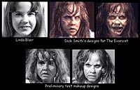 The exact opposite of this trend is what Smith did in the Exorcist. After some tests that he wasn’t happy with, (in which he had made more dramatic structural alterations), he ended up just altering the simple, subtle things on Linda Blair’s face that made her "sympathetic" and "cute". The alterations were hidden in the design of the scars, and if you examine the facial structure of the "after" stage, it’s not really that different than the "before". He just knew what little things to change on a face that TOTALLY changed
how we react to a character, emotionally.
The exact opposite of this trend is what Smith did in the Exorcist. After some tests that he wasn’t happy with, (in which he had made more dramatic structural alterations), he ended up just altering the simple, subtle things on Linda Blair’s face that made her "sympathetic" and "cute". The alterations were hidden in the design of the scars, and if you examine the facial structure of the "after" stage, it’s not really that different than the "before". He just knew what little things to change on a face that TOTALLY changed
how we react to a character, emotionally.
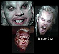 Another problem I notice is that some of the "scary" designs on certain (currently running) vampire TV shows, are so mired in cliché that they have NO effect on me. I’ve been walking down the street and seen people more frightening than the standard "vampire" look they’ve settled on for the show. Why is this? Once again, it’s the rip-off factor. Greg Cannom created some very effective and creepy vampire designs for The Lost Boys in the late 80s.
These current TV show’s designs not only copied this type of design, but have turned it into the stalest of cliches. (The opinions in this article do not necessarily reflect the views of this website in general, nor it’s webmaster. They are solely the views of this writer). They slap the same forehead on every vampire, whether it is appropriate for the rest of the character’s face or not. It’s very sad, because they turned something startling into a ridiculous cliché. One interesting thing is that John Vulich was one of Savini’s main artists at the time of Chainsaw 2, and does extremely good work.. He is now head of Optic Nerve Studios, who make many of the prosthetics for some current TV programs. He still does very high quality work, it’s just that (probably because of TV shooting schedules) some of the designs have fallen into a generic state.
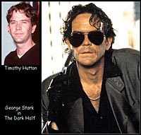 Another example that demonstrates a proper understanding of character is in the film "The Dark Half". In a double role Timothy Hutton plays a normal man, and also his supernatural doppelganger, George Stark. John Vulich did the Stark makeup. It’s one of the greatest examples of subtle character design I’ve seen.
Just compare the actor with the final makeup job. I’m not going to tell you what was altered. I’ll just say that it demonstrates a complete understanding of what very subtle things need to be done to create a face that has a certain emotional impact on us. Hutton’s amazing performance did the rest of the job. By the way, the prosthetics for this were sculpted using reference shots of real people. I happened to come across one of the shots used, in a photography book by Richard Avedon, I believe, about regular people in the American West. Pictures of real people are invaluable for this sort of thing.
Another useful approach is studying comparative anatomy. No, you don’t have to go to school for this, just notice the little things that make some people look similar, and at the same time, what those people have in their nature that sets them apart, and makes them unique. For example, remember those "Separated at Birth" photos you used to see in Spy magazine? Take a look:
 Comparisons like this are very enlightening. It allows us to analyze just what it is about the curve of a jaw line, or the slope of a forehead, that causes us to project a certain personality onto a person’s face.
Remember, after all, that this is what personality is. It’s only our projection of what we THINK a person is like, based on what he or she looks like. In real life we can never judge a book by it’s cover, and we can’t judge a person by their face.
However, in the arts, in showbiz, we actually NEED to allow the audience to judge a character (or a monster) by our first impression of their outward appearance. There’s only a certain limited amount of time in a movie to establish character, and it has to be conveyed through visual clues. That’s why certain actors are "right" for certain roles. They fit our subconscious image of what that type of character SHOULD look like.
Well, I hope you have found something useful in all of this. Now, get to sculpting, and good luck.
Here are some books that have useful information on the subject of sculpting with character:
"Making Faces, Playing God" by Thomas Morawetz
"The Artist’s Complete Guide to Facial Expression" by Gary Faigin
"Drawing the Human Head" by Burne Hogarth
"The Complete Book of Caricature" by Bob Staake
"Modeling the Head in Clay" by Bruno Lucchesi
"Stars" by Sebastion Kruger
Here are some artists and sculptors who have a great sense of character in their work:
Jordu Schell /
Dick Smith /
Miles Teves /
Mark Coulier /
Greg Polutanovich /
John Brown / Mark Alfrey /
Dynamic Design /
Casey Love
Also, take a look at some of my work in the Gallery section of this website. And even more can be seen at www.imageworksfx.com